We are happy to provide free card designs for every one of our clients. But companies who have their own design staff often wish to create their own designs. Many designers, while very competent in design for general print and web, have little experience with badge design. So, to help, I’ve come up with four simple things to avoid when designing your ID cards.
Let’s start with the simple card example from our home page. It is simple, elegant, and legible.

1. Avoid flat colors.
Flat design has become really popular for web content. So, naturally, you might be inclined to make your card design as flat as possible. Flat colors, however, will show wear on badges more quickly. A little gradient or texture will help you badges look newer for longer.
Exceptions:
Flat colors work well when there are more of them. If there are enough elements, card wear will be harder to notice.

The Same Design with Flat Colors
2. Avoid dark colors.
Yes, contrast is important on ID badges—after all, the point is to see the person’s name. So, you might be inclined to go darker with your colors to make these names pop. 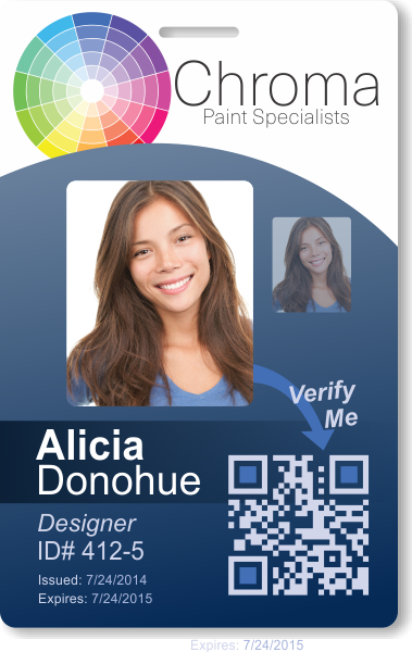 What you may be forgetting, however, is that badges should be welcoming to clients, making them feel at ease. Dark colors don’t usually accomplish this. (If you notice, in our original example we chose the gradient to get darker near the text—this is no coincidence. It gives high contrast while maintaining a light feel.)
If you’re really worried about contrast around the name, consider adding a band of darker color around the text. This will make it more legible, while not detracting from your friendly message (as in the image to the left).
Exceptions:
Cards which are used strictly for safety in environments where there is little client interaction. Here identity verification can be extremely more important that a welcoming feel.

The Same Design with Dark Colors
3. Avoid funky fonts.
You may try and jazz up your design with a more interesting font. Don’t. Again, the major focus of an ID badge should be identification. Funky fonts often obfuscate text. This is counterproductive to your ID badge program no matter how much you might like the font from a design perspective. Go with something simple and legible from a distance. It will encourage more client-employee interaction.
Exceptions:
None. Move the mouse away from “Papyrus” now.

The Same Design with Funky Fonts
4. Avoid straight lines.
Not only is your card a rectangle, but so is the ID photo. Break up the monotony with a little curvature. Not only will this make the ID photo “pop” a little more, but it will give your company a less rigid feel.
Exceptions:
Straight lines work well with a lot of texture—particularly when that texture is very linear.

The Same Design without Curvature
Honestly, like all design, rules are meant to be broken (except the rule that you should never stack text—never, ever stack text). So, these are only guidelines. If you create a beautiful design through a blatant disregard for any of these suggestions, I’d love to see it. Or, if you want to provide your own design, but want our designers to have a look at it and make some suggestions, don’t hesitate to contact us! In the end it’s your business, your card, and your design.