In design it’s really easy to forget the possibilities! Take an ID card for example. ID cards are commonly seen with really simple designs, but they look GOOD! In this post I’m going to cover how to make a simple, boring badge look professional in 3 steps.
Step 1: Take a step back.
It’s easy to just put something together, but why doesn’t it look good? Taking a step back and assessing your design is a big…step! Here, I have an ID badge that I have seen a lot both working in this business and outside of it in my day-to-day life. It’s just the bare necessities required by the company to be on an ID badge, no design at all. This is what I call a starting point. Look at the card and think about how you can make it go from drab…to fab!
The first thing you will notice is the boring font. Sure, Arial can be a nice looking font when used correctly, but in this context? Let’s scrap it. Which leads us to…
Step 2: Typography
This is the magic element, folks. When font is used as a design element it becomes Typography. This is the way you will get your bland ID card looking like a piece of artwork. Because the main point of an ID card is what is written on it the font is the most important thing to get right, but this often goes overlooked. There are many ways to get inspiration for how you want the text laid out and the font you want to use, but the very first thing you should look at is your logo – if you have one!
That being said the logo is something missing on the card above because some companies just don’t add it. When a logo looks good it is very easy to make the rest of the card look good as well. When the logo is “nothing special” then you’ll have to muster up a bit more creativity. Regardless, you want to keep with the your brand the best that you can. The logo and then the website are the first things we look at in terms of design inspiration when creating ID cards.
So, let’s add the logo for this company and work our magic with the font.
All I did to this ID was add the logo and change the font and style of the text and it has already perked up this card. I used the same font that was used for the Healthcare text in the logo in keeping with the brand which is very important for a company – especially with your IDs!
Looking better, huh?
As a side note – notice how the logo on it’s own makes the card look better? Never underestimate the power of a well designed logo!
Step 3: Get creative!
And I don’t mean going and pasting pictures of your building, coworkers, and a bunch of swirls on your card. Getting creative is not only about the fancy images and use of colors. Placement and layout are just as important, if not more-so, than a pretty background. Let’s see what happens when we don’t marry this layout and decide to get creative. We’ll also add in a splash of color to help liven the card up further.
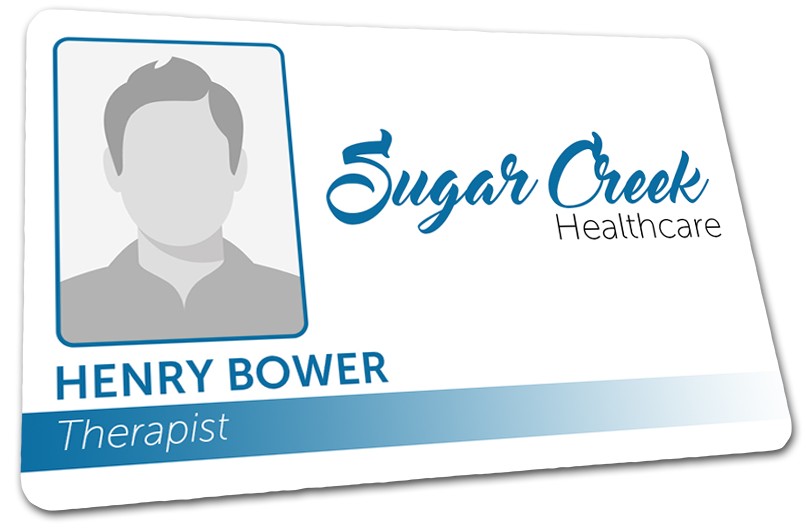
 And now we are done! Look at this fab ID card. And all I did was get a little creative. You don’t have to have a fancy background to sport a good looking ID badge. All it takes is a good layout, nice font, and a little dab of color and you have yourself a professional badge.
Here is what I did:
- Rounded the corners of the photo, added a border, and made it smaller.
- Moved the name and title down to the bottom left under the photo, bolded the name further and changed the color, changed the color of the title, and made both smaller.
- Added a gradient bar behind the title.
- Made the logo bigger and centered it with the photo to fill in the space.
The trick to a great and professional design isn’t a complex background. It’s how you use what you’re given. We get a lot of clients that want simple designs such as the one above and we are happy to give them the best looking one we can. Obviously it helps if they have a nice logo to compliment the look of the card, but that’s not always the case so it provides a nice challenge. Don’t get me wrong, we love doing complex designs as well, but there is something very satisfying about making simple something to be proud of.


