Our card designers are often asked for guidelines on laying out a professional badge template. Businesses and organizations want to know what the best approach is. It’s not always obvious.
Fortunately, this guide is here to help. We take a look at all of the factors you’ll need to consider when developing a great ID card, and who you should go to if you need help. (Hint: us!)
Here are the most important considerations which we feel make for truly professional-looking ID cards. Not all of them will apply in every case, but if you follow most of them you’ll come up with highly professional results!
Company Logo
 Make sure your logo is clear and legible, with no pixelation. Customers, colleagues, and other stakeholders should be able to recognize company staff immediately. If logos are difficult to see, brand association won’t occur, and you will lose opportunities to build awareness and trust.
Also, consider dropping any long taglines which would require reading very small characters. You want something that people can absorb in a split second, without having to squint. Make sure whatever you say is impactful and relevant to your brand requirements.
Consistent colors
When it comes to branding, consistency matters. According to figures, keeping your brand the same across all channels (such as photo ID cards) increases revenue by 10 to 20 percent.
Therefore, when it comes to employee IDs, use the colors in your logo without trying to mix in too many additional colors. If you must change the colors, ensure they are faithful to your secondary scheme.
You can also adjust colors by location. For instance, you might have bright and cheery themes for employee badges in cheaper locations, and then darker and more luxurious schemes at upmarket venues. Just make sure that if you do make these changes you don’t confuse your customers. They should be familiar with both aesthetics.
Legible fonts
You also want to pay attention to legibility. You don’t want ID card text to look like it was penned by a disheveled grammar school pupil.
Classic fonts are always more readable. According to GatherContent, the most readable fonts are:
- Times New Roman
- Arial
- Helvetica
- Tahoma
- Verdana
- Lucida Sans
- Lucida Grande
- Calibri
Cards are generally easier to read with sans-serif fonts. The least readable typefaces are Comic Sans, Trajan Pro, Copperplate Gothic, Courier, Bonzai, and Neuland-Inline, according to experts. While they look cool, they aren’t the best for communicating clearly with stakeholders.
Just remember that the types of fonts that are easy to read on a screen might not be as legible in real life. If in doubt, do what newspapers do: go for Times New Roman, or something similar.
Big photos
Regular corporate ID badges dedicate the majority of space to banal elements, such as bar codes, employee numbers, and addresses. But these aren’t particularly helpful for your target audience. Sure, they make badges appear more “corporate,” but they are not particularly engaging.
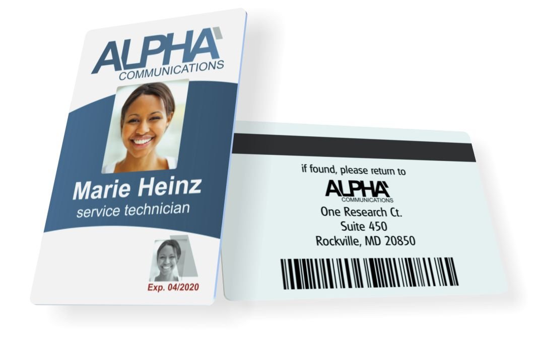
That’s why we’re fans of big photos. We think that organizations should dedicate as much space as possible to pictures of employees, saving other stuff for the back of the card.
This is all to do with how people respond to pictures. The eye automatically finds photos of people attractive and interesting, so giving them more real estate always helps.
There are practical security reasons to get large ID cards, too: they make it easier for guards to identify people. If you have a 1 cm by 1 cm ID photo in the top right of your cards, staff will find it almost impossible to check faces and security will suffer.
Great Photos
As well as big photos, you also want to include great photos. Avoid cringey passport photos like the plague. (Remember, you don’t have to follow strict government guidelines when it’s an employee photo).
Taking these photos is also easier than many brands expect. These days, there are numerous corporate photo professionals out there. They can make your team look great, no matter what they look like in person.
On a budget? No problem: you can also take great photos yourself. Just make sure that you:
- Get the subject to relax. Smile, tell a joke and make them feel welcomed. Give them advanced notice that you’re planning a photo session so that they can look and feel their best.
- Invest in decent equipment. While your iPhone camera might be great, you’ll want to use professional equipment whenever possible. Having a decent camera is important, but arguably post-shoot editing software is even more critical. If you want to save costs but don’t have all the editing tools you need, you can sometimes take photos yourself and then send them to professional editors to touch up.
- Choose a decent location. Lastly, you’ll want to choose a reasonable location: somewhere that’ll complement the rest of your brand. Most companies choose a light, plain background, though darker backgrounds can work for legal and consulting firms.
Limited information
Don’t try to put too much information on the front of the card. The card should be for glancing at, not reading. For example, you generally don’t need a full address/phone/fax, or even your website, as this is not normally where people look to find that information.
Remember, ID cards are for identifying people in your organization, wherever they represent you, not marketing. Therefore, keeping information limited is okay. You can use other channels, such as business cards, to provide clients and customers with any additional contact details or pricing information.
Moreover, putting extra information on ID cards probably won’t engage prospects more anyway. That’s because the average person has an attention span of just 8 seconds, around 4.25 less than in the year 2000. They might notice the picture, but they probably won’t remember an email address or telephone number.
Subdued backgrounds
When it comes to professional photo ID cards, you need to think in terms of a visual hierarchy. At the top should be the critical information, like the colleague’s name and photo, and at the bottom should be the color scheme.
That’s why we recommend clients use subdued backgrounds. Sure, you can make it attractive by using, for example, a faded image or a watermark of your logo: these always look nice. But make sure it doesn’t distract from the important information in the foreground.
As a general rule of thumb, you want bold, block colors for foreground elements, and softer, faded colors for background elements. You also want more clearly defined lines for the most prominent elements, and fuzzier ones for those further back. Successful brands find ways to include their branding across all elements of the photo ID, including the background.
Vertical/Horizontal
You’ll also need to decide how you want your employees to fasten their ID photo cards as this will determine whether they wear them portrait or landscape. One of the most common corporate options is the strap clip. These are economical, affordable, and seen just about anywhere. Most are made from vinyl and have metal buckles, but you can get cheaper fully plastic ones, too.
Unfortunately, they can leave marks on clothes, so prestigious organizations will want to avoid them. Plus, they can be fiddly to use when swiping credentials.
Another option is to use conventional badge holders. These are durable, offer great security against credentials skimming, and don’t require you to punch slots in your cards. However, it can get annoying to remove cards from badge holders every day.
Lanyards are a good option for vertical ID cards. They create brand
awareness and offer better security because of how prominently people wear them. They also hang better when arranged in portrait and don’t flap about or invert as much. The downside, of course, is that they can get caught and require a breakaway feature for health and safety.
And, lastly, some organizations use badge reels which, again, orientate photo ID cards vertically. With these, employees simply pull on their cards and place them in the correct position when scanning in or presenting to security guards.
The downside? Just like lanyards, they can get caught.
Back side

Lastly, you’ll want to consider the back side of your card. Here you can put secondary information, like company address, contact information, “if found” instructions, barcodes, etc. This way, you leave more room on the front of the card.
When it comes to the back of the card, branding isn’t as important. In fact, most organizations simply mention their name, and that’s it. The rest of the space if for all the details you don’t want to put on the front.
You can also use much smaller fonts on the rear. The amount of information you can cram is often quite high.
Go here for more information on how to use the back of your ID →
So, there you have it: how to design a professional photo ID card. Did you learn anything?


