A logo is the cornerstone of a businesses image. It’s one of the first things a consumer sees and is a potential factor in dictating how they feel about the company – for better or worse. For a lot of companies, this is incentive enough to invest in their company image through their logos and branding material. Often times, this plays into how they want their company represented through all digital and printed material. Including their ID badges. This post will go over different ways your logo can factor into the design of your ID badges in more ways than one.
Logo Foreground Use
Some companies do not want to see their logos disrupted or untouched by anything else. The full logo typically stands on it’s own in the foreground. We can take this a step further if there is an image in the logo. A symbol or emblem that accompanies the text stating the company name. In this instance, we would set the image alone on the card in another part away from the full logo. This can help balance out the design while driving home the full effect of the branding of the company.
Watermarks in the Foreground
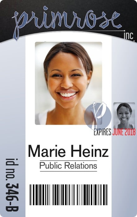
Another way to implement your branding image in the foreground of your card is by making it a watermark that overlaps a prominent piece of the ID. Such as the photo in the example to the right. This watermarked logo does a couple of things for the badge. Because of the fade over the image of the employee it makes it hard for anyone with ulterior motives to duplicate the badge. It also acts as a very nice design piece which reinforces the branding of the company.
Logo Background Use
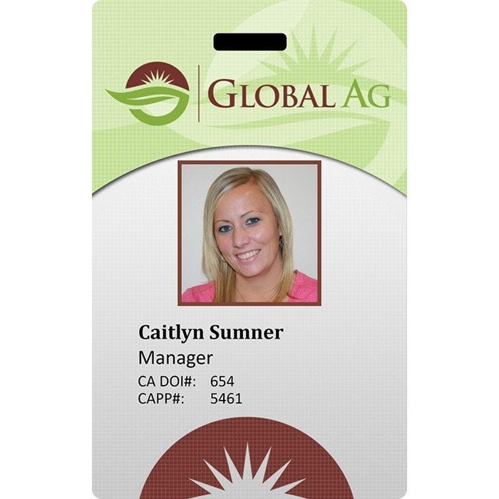
Below, are examples of multiple ways that the logo can be used in the background of the card. If you notice, most of these instances see the logo large and off-set. This is a great way to balance out the look of the card and makes it more creative looking. For the GlobalAG design, it was used in a couple of ways as design pieces. The logo is faded into the background at the top and a piece of the logo is prominent at the bottom, not faded. When you know that nothing is going to overlap the logo, by all means make it more prominent of a design piece!
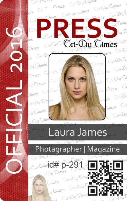
For the Tri-City Times, they didn’t have an image. They just had the name of their company which was used to create a repeating watermark in the background of the design. We have talked about watermarks before. In this blog post which outlines the benefits for security as well as design to using them.