If you’re coming to us to have your ID badges printed, you may already have a logo and established branding that you want to apply to your cards. However, perhaps your logo includes only one or two colors and you haven’t given much thought to what other colors might accent your ID badges. Now that you are going through the process of designing and printing your badges, you might want to think a little more about what you want them to look like.
The Importance of Choosing the Right Colors for Your ID Badges
Colors on an ID badge greatly affect how others view your company. ID badges and holders are often very visible, and they can be seen by your employees and clients, as well as by anyone external to the company who might see your employees when they’re out and about. Your brand colors can say a lot about your company, affecting how people view you in terms of professionality, personality, success, and more. Studies have shown that a product’s color influences 60-80% of a customer’s purchasing decision, so it’s important to think about colors in other areas of your business too.
Furthermore, the colors that you use in your ID badges speak to the approachability of the employee wearing that badge. Different colors may be seen as warm or cold, friendly, calming, inviting, fun, or invoke other emotions and thoughts in people when they look at them. Some colors might make your employees seem less approachable, while others could give them the impression of being friendlier and more approachable.
Of course, our professional designers are more than ready to help. But it’s something worth thinking about when you’re planning the design of your ID cards. After all, no one knows your business like you. Even the most seasoned of badge designers don’t have a handle on the nuances of interaction your employees will have with others. Your insider knowledge can help you to go into designing your ID cards with an idea of what you might want, as well as provide designers with details that they won’t be able to determine on their own.]
Color Theory
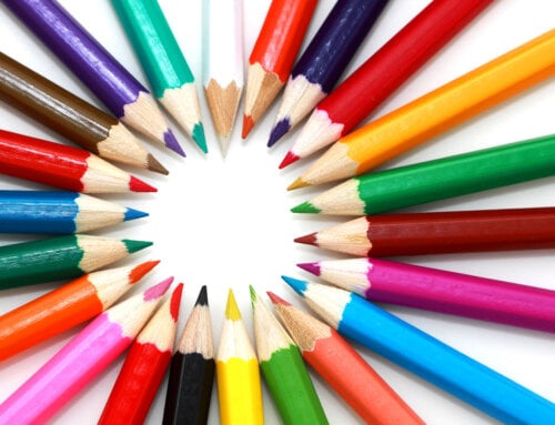
One of the ways to think about how the colors you choose will be perceived is to Google “color theory”—you’ll find enough reading material on the subject to last a lifetime. While color theory might not be an exact science, there are lots of ways that people often perceive different colors and the way that colors can look together when they’re combined in different ways. Color theory is used by many people in the visual arts and can be useful to understand if you want to choose the right hues for your ID badges and any accessories you add to them.
Color is all about perception. People will associate different colors with different feelings, and they will remember brand colors too. For example, when looking at a product people will decide whether they like it in 90 seconds or less, and the color of the product has a huge influence on their decision. There are different color mixing models that you should use for different purposes to get the results that you want. It’s also important to get familiar with the color wheel when you’re looking for the right colors and you want to match the right shades together.
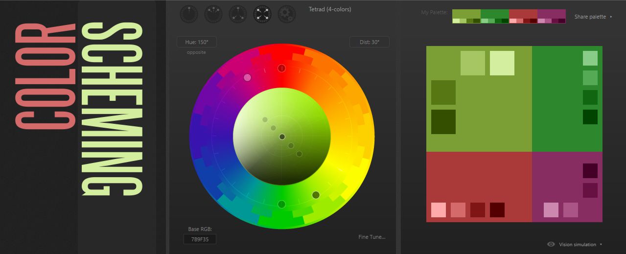
Might I suggest going to paletton.com and playing with their color scheme picker? You can enter manually the colors already in your logo and it will suggest palettes based on that. It’s a neat little tool. It presents you with a color wheel so you can explore the many different hues that are available, and you can easily create a color palette that might work for your ID cards.
How Are Different Colors Perceived?
It’s worth giving at least some thought to how people perceive various colors. There are no hard and fast rules, but there are many common associations with different colors. Some colors tend to be perceived as warm or cold. Some particular shades might be viewed in a certain way. For example, red might be seen as a passionate color, while green can be associated with nature, calmness, and trust.
Here’s a quick overview of how people might see certain colors:
- Red – passion, excitement, energy, aggression
- Blue – trust, security, responsibility, confidence
- Purple – royalty, sophistication, spirituality, mysticism
- Green – health, nature, wealth, safety
- Yellow – warmth, light, positivity
- Orange – playfulness, fun, exuberance
- Brown – natural, durable, dependable
- Black – sophistication, timelessness, power
- White – pure, clean, softness
Start with Company Colors
Of course, you already have your brand colors, so you might want to start with them when you’re choosing the right color scheme for your ID badge design. You could go with different, complementary colors instead, but if you want to include your company logo, you will have at least one or two of your company colors on your badges.
Use your company colors to input them into a tool like Paletton and get suggestions for a color palette that could work for your ID cards. Or you could simply take your company colors and compare and contrast some different shades to see what looks good. Think about what you want to convey with your ID cards and whether there’s anything, in particular, you want people to think about when looking at them. Perhaps you want to convey authority, friendliness, trustworthiness, or other qualities for and about your staff.
Simplifying Your Color Choices
If this is all sounding a bit too complicated, it doesn’t need to be. You definitely don’t need to choose many different colors. After all, an ID card is only so big, and you don’t want to overwhelm it with color. There are plenty of attractive two-color combination design options, which will help you to simplify everything and ensure it looks neat and professional.
The benefit of sticking to two colors is that it makes things simple and allows you to highlight the most important parts of your ID card. Take a look at this link to see some examples of color combinations that use just two hues. You might not choose any of those exact colors, but it shows how two colors can be very effective without having to have a color palette of three or four colors.
Alternatively, you can simply stick to one color. This can be an effective option if you want to really simplify things and avoid having too many colors detracting from what else is on the ID badge. If you have one prominent brand color, you might want to use that to match your logo. Or perhaps you want to use different colors for the ID badges of different workers or people in different departments. It could make it easier to identify a doctor or a nurse, for example, if you use different colors for their ID badges.
Keep Your ID Cards Clear
Choosing the right colors for your ID badge design is important but you also need to remember that what matters most is having a clear and legible badge. The wrong colors, especially in combination with other design elements that could be unwise, might make your ID badges much less clear. You don’t want the colors that you choose to detract from the important information, especially if they are meant to provide essential details and identification at a glance.
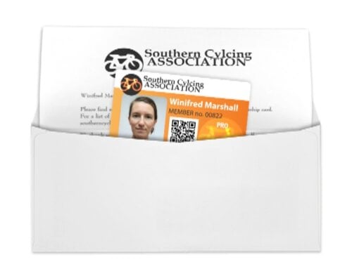
Our free ID badge templates will show you what your ID badges can look like before they’re printed. It gives you a chance to go over the color design and any other parts of the design to check that it looks good and everything is presented clearly. You might want your logo to be prominently displayed, but there might also need to be space for details such as the wearer’s name and ID number, a barcode or QR code, a photo, or anything else that you might need to include.
You’re the Authority
It’s important to keep in mind that, although our designers can help you with their expertise, you’re the expert on your business and brand. It’s you who has the real knowledge about your brand and about how you want to present your company both within it and outside of it. You might already have a good idea of what colors you want to use, but it’s worth exploring some different color schemes if you’re looking to add to your usual brand colors. You can then discuss what you want with our design team to make sure your ID cards and any accessories you choose are just what you need.
As always, do not hesitate to contact us if you have any questions regarding this. Our designers create each template specifically for your company. They revise, working with you, to get your design perfect. It’s helpful if you approach us with some idea of what colors you might want and the requirements of your design so we can help you to come up with the perfect template. We want to make sure you are as successful as possible, after all—it means you’ll be ordering more ID badges!